New Volvo Truck Symbol
Volvo VNL Platform. Volvo Trucks North America
2
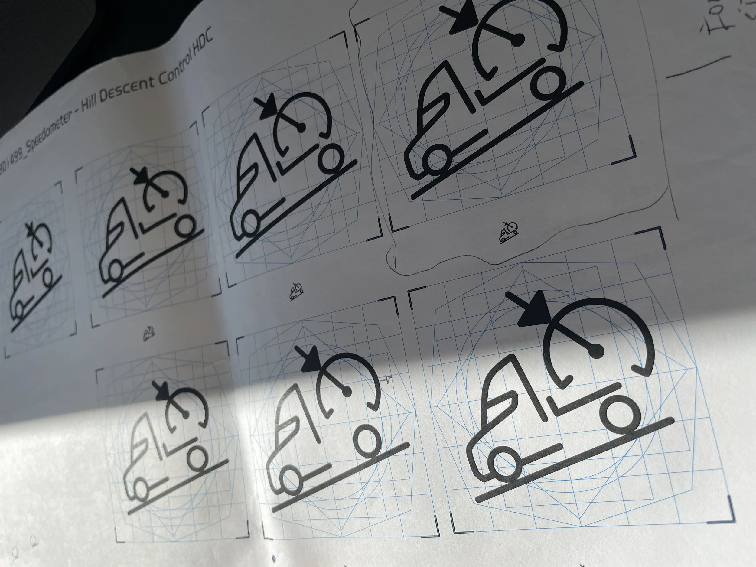
Core Icon Views designed along with other iconography
4
Touchpoints carrying the mark: hardware, software, marketing, app
1
Single geometric construction, reused at every size
VNL
Platform - North America’s flagship heavy duty truck
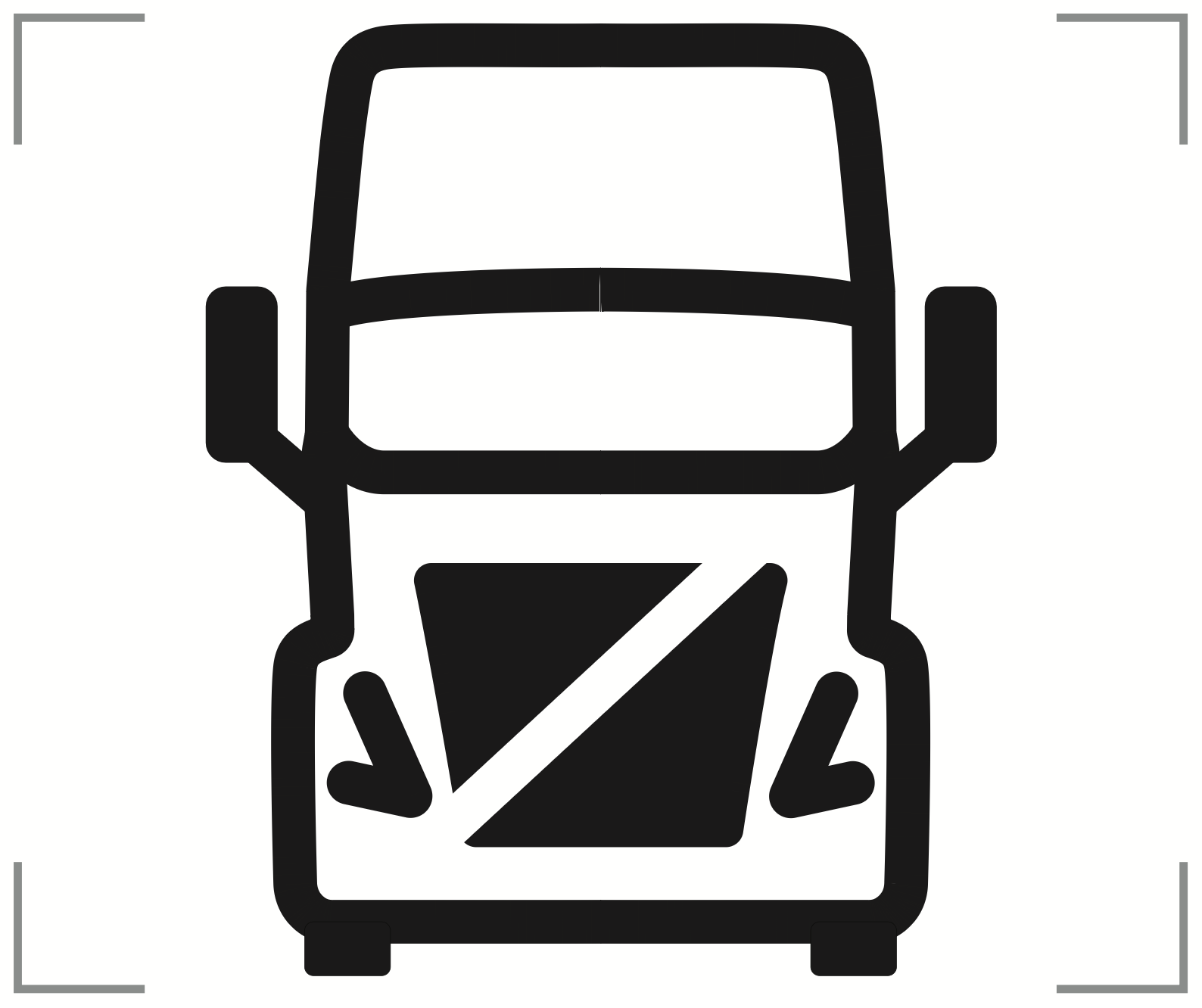
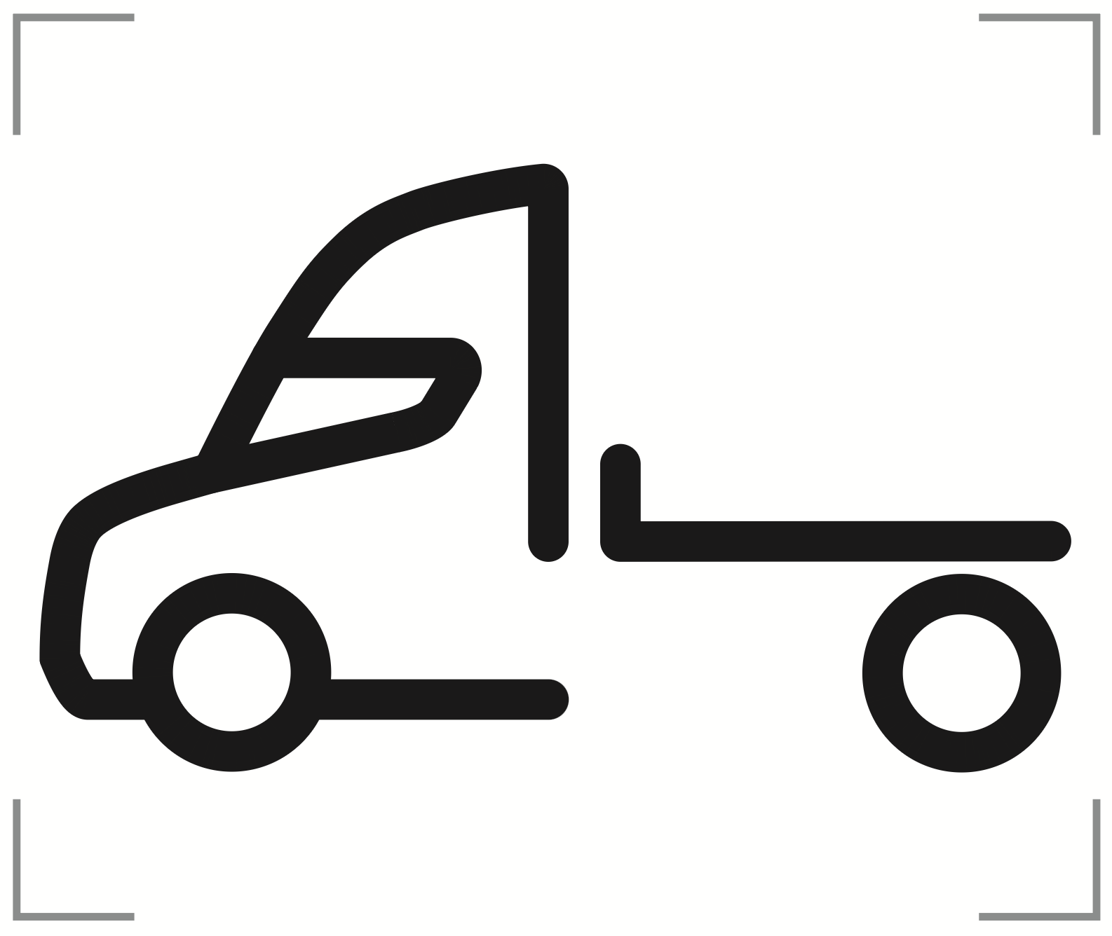
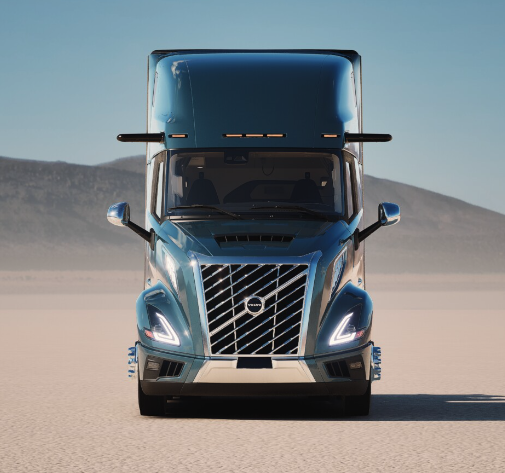
The truck symbol, front and side profile, built on a keyline construction grid — the same discipline used to construct a wordmark or corporate logo, applied to a functional vehicle icon.
01 - Brief
One symbol, every surface, every size
The VNL needed a single vehicle mark that could stand in for "the truck" itself — recognizable whether it was etched into a control module the size of a coin, animated in a launch video on a 40-foot trade-show screen, or sitting as an app icon on a driver's phone. It had to read instantly, hold up at any scale, and stay identical across every context it appeared in.
Why a symbol, not a photograph or a logotype
A photographic truck doesn't scale down to icon size without losing its silhouette, and a wordmark doesn't communicate "vehicle" at a glance across a language barrier. The symbol had to do the job a photo and a word both fail at: read as "this is the truck" in a fraction of a second, at any size, in any market.
My Role
Interaction Designer- Symbol & Icon design, Brand Identity Multi-brand
Timeline
2019 – 2020
Released on the market in 2025
Company
Volvo Trucks North America
(shared with MACK & EU platforms)
Used Across
Physical control hardware, digital cluster & infotainment, MyTruck app, marketing & launch video
02 - Construction
Built on a grid, not drawn freehand
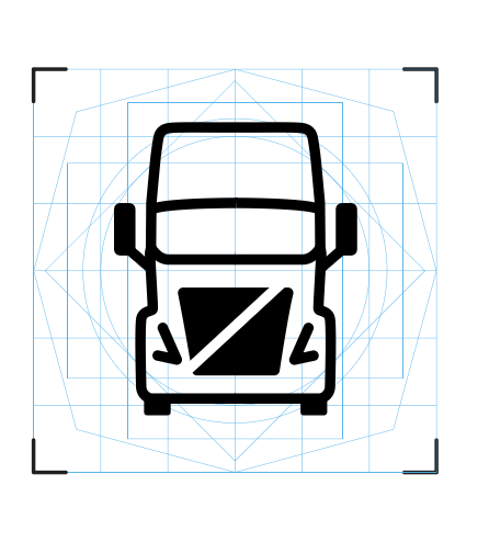
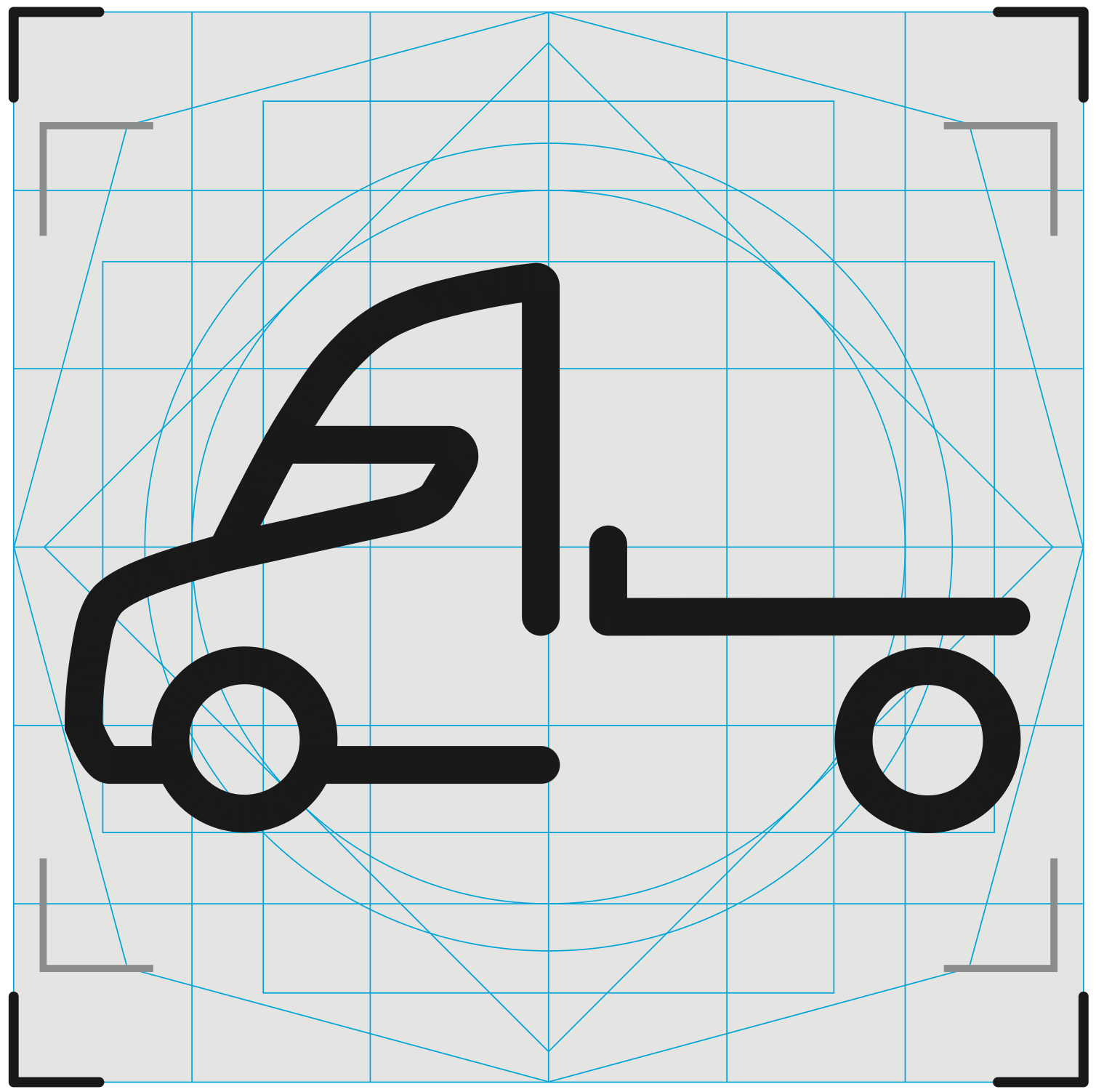
The front-elevation mark was constructed on a geometric keyline grid — squares, circles, and diagonal guides establishing consistent proportion, stroke weight, and corner geometry — the same construction discipline used to build a corporate wordmark or a transit pictogram, applied here to a functional vehicle symbol.
Construction grid for the Volvo VNL truck symbol, showing keyline geometry, proportion guides, and safe-area corner marks
The front-elevation symbol on its construction grid — proportion guides and safe-area corner marks ensure the mark reproduces identically whether it's silk-screened onto a hardware module or rendered at icon size in software.
Why build a side profile too
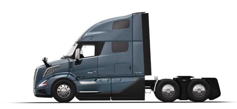
The front elevation reads best in direct-control contexts—a driver looking at a module or a cluster icon head-on. A side-profile view was needed for contexts where orientation and proportion matter more than a face-on read: spec sheets, side-loading diagrams, and marketing compositions showing the vehicle in motion or at an angle. Both views share the same construction grid, so they read as one system rather than two different marks.
03 - System Usage
The same mark, reused rather than reinterpreted
Rather than treating each medium differently, the symbol carried across every touchpoint unchanged—the consistency itself makes it recognizable as "the vehicle" wherever a driver, technician, or customer encounters it.
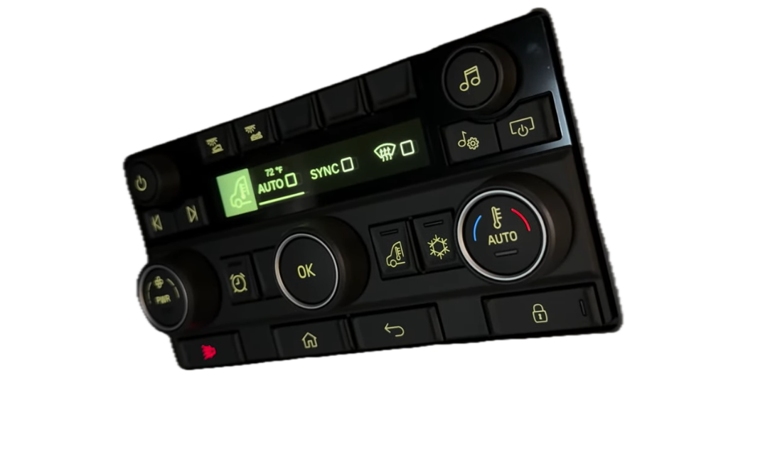
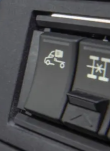
HARDWARE
Applied to physical control modules and badging, built to the same proportion grid so it reproduces cleanly at manufacturing scale.
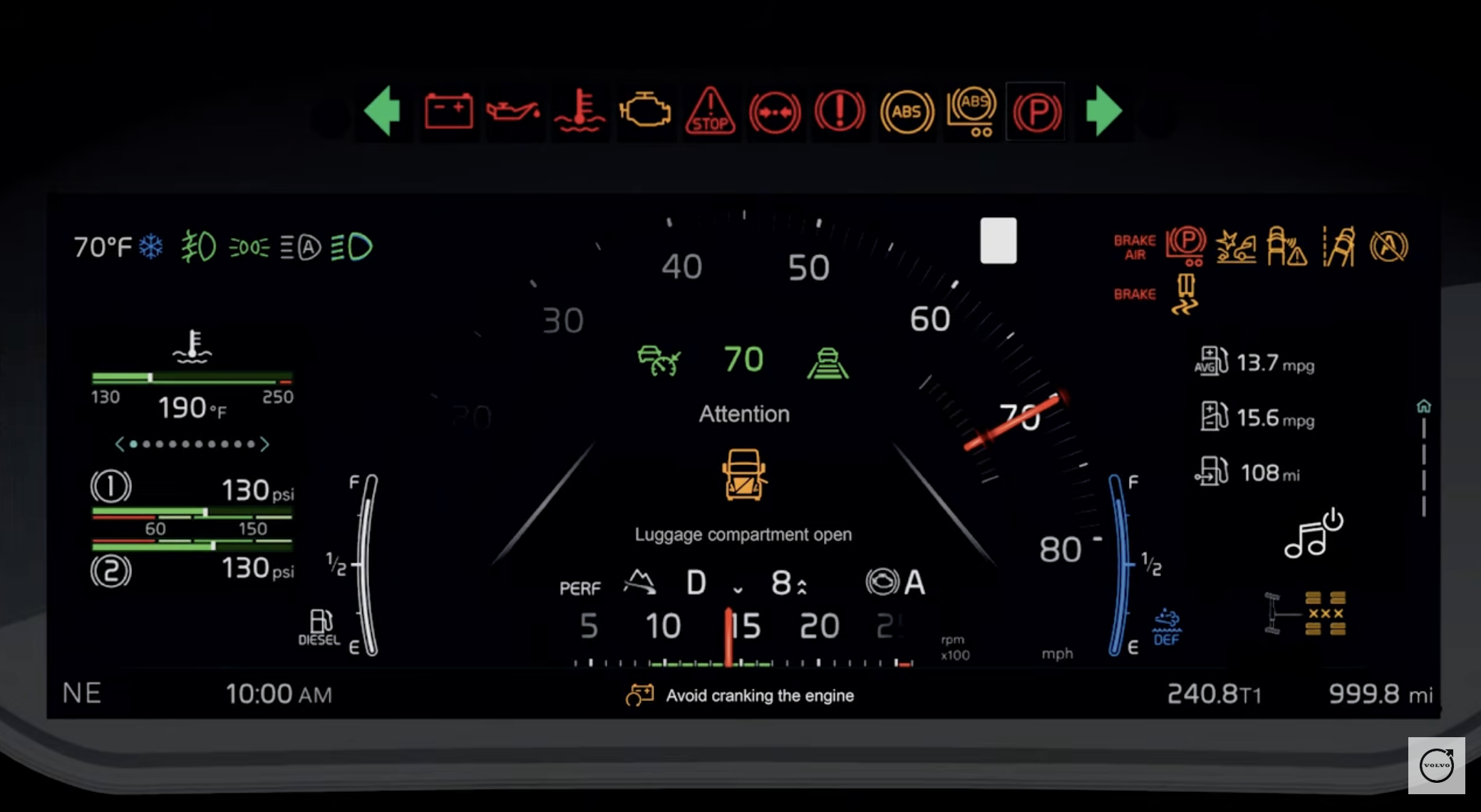
SOFTWARE
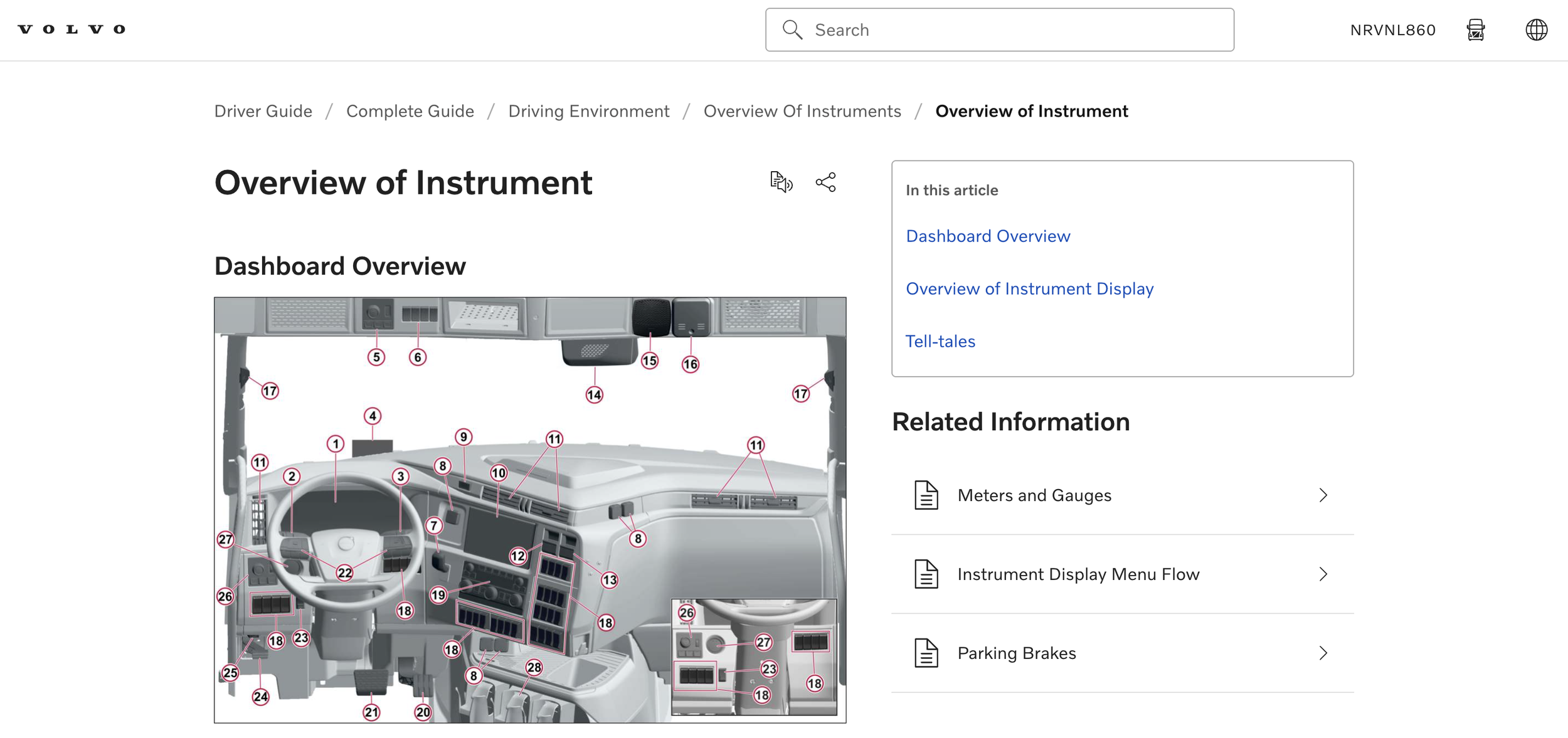
Used in the instrument cluster and infotainment as the vehicle-identity mark within system diagrams and status screens.
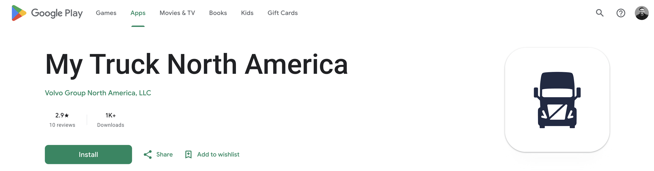
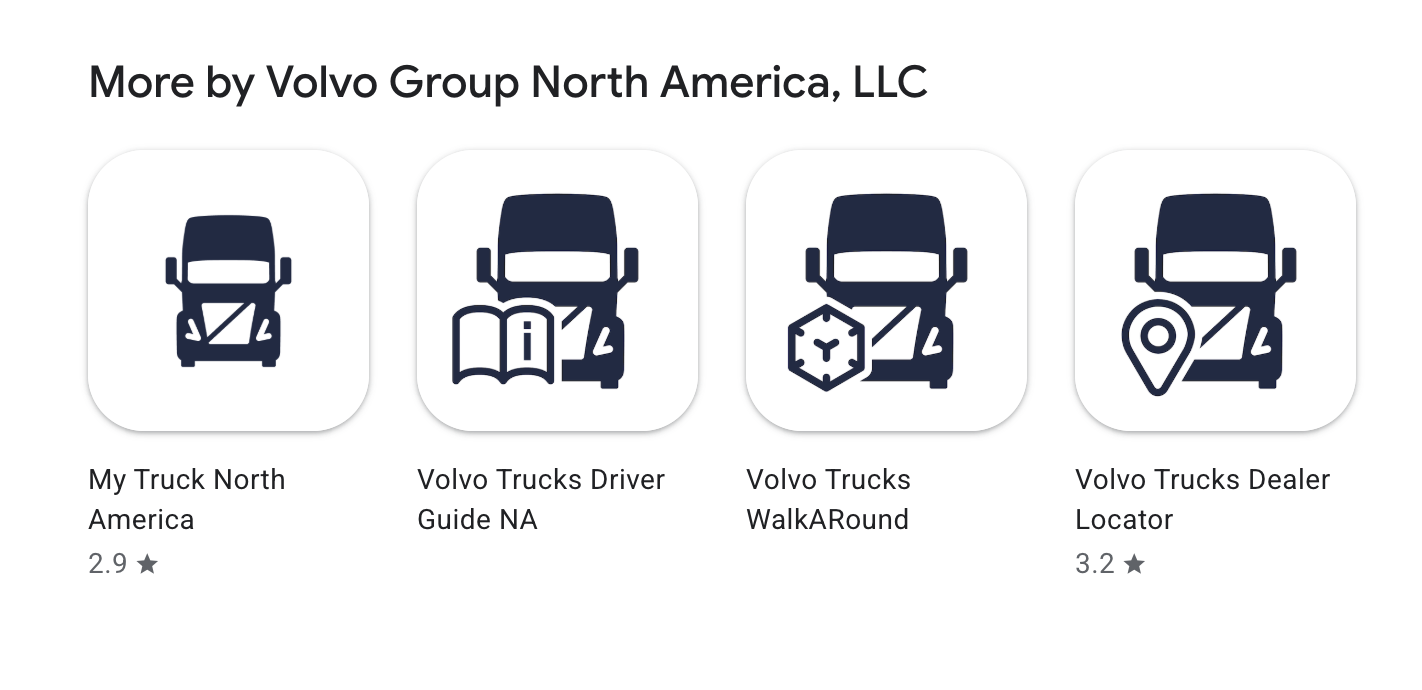
MY TRUCK APP
Serves as the vehicle icon inside the companion app, connecting the in-cab identity to the driver's mobile device.
MARKETING & VIDEO
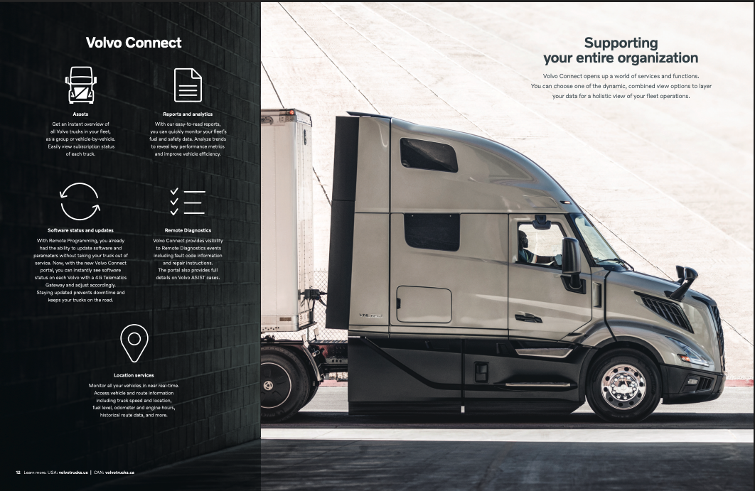
Reused in launch and marketing motion graphics as the platform's vehicle mark — no separate asset created for media use.
04 - Outcome
One mark, shipped everywhere the vehicle needed identifying
The symbol became the platform's default way of representing "the vehicle" across every discipline that touched the VNL program—design, engineering, and marketing—without needing a separate asset for each.
Hardware → App
One mark spans physical modules to mobile software
2 Brands
Shared across Volvo and Mack platform implementations
1 Grid
Front and side views built to one shared construction system