
IN PRODUCTION
INTERACTION DESIGN
AUTOMOTIVE HMI
SDK DESIGN SYSTEM
MULTI-BRAND
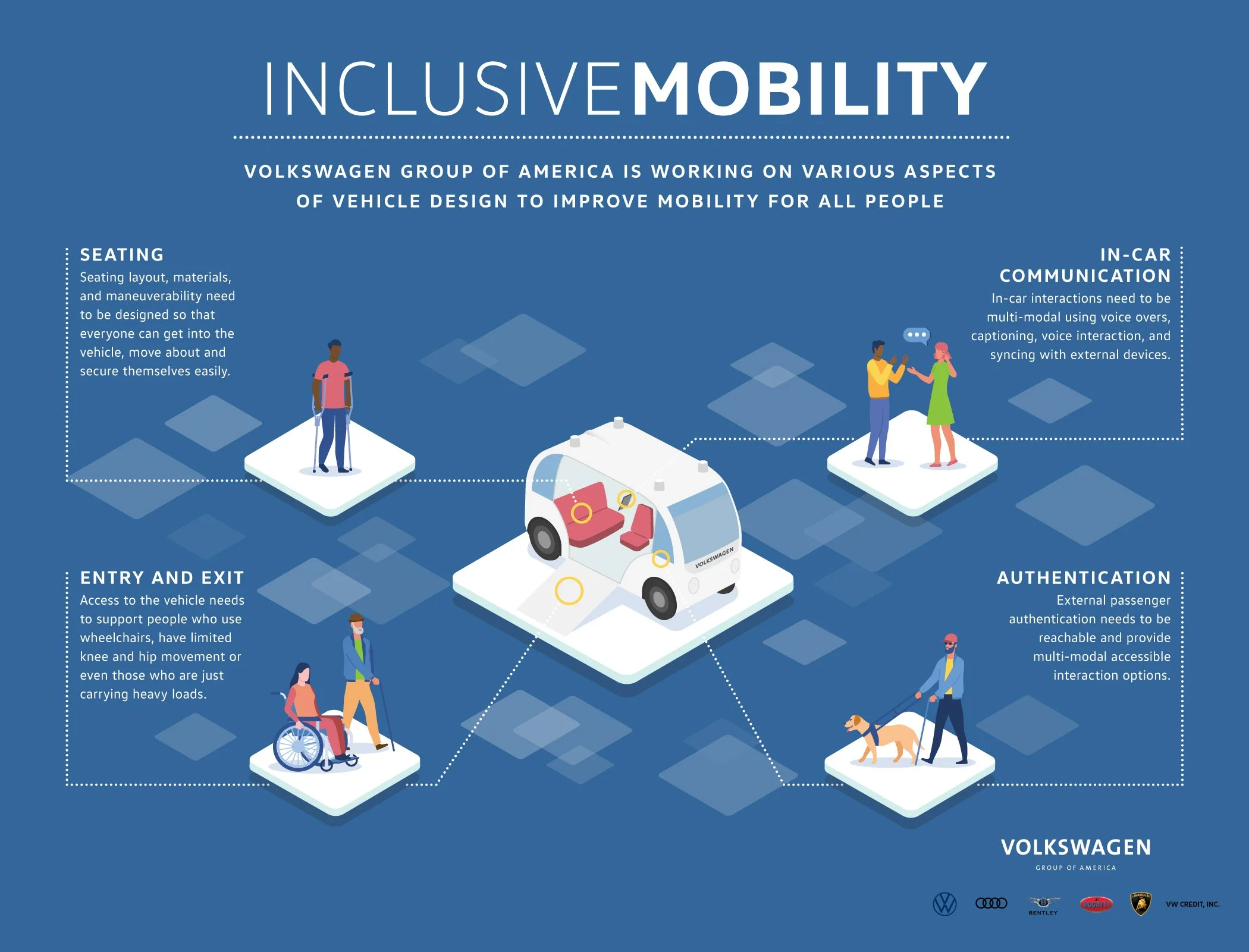
Inclusive Mobility
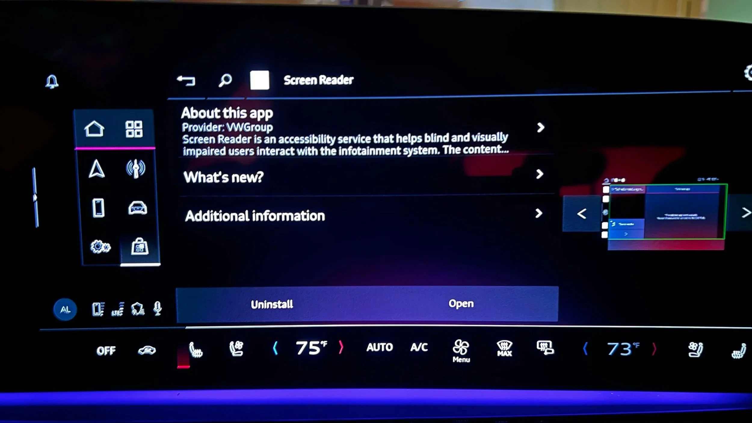
Accessibility Service. Volkswagen Group. CARIAD Inc
20M
Vehicle shipping this system globally
4 +
Brands architected on the SDK
2
Major versions - V1 2025, V2 2026
CVAA
Regulatory compliance, first at this automotive scale
01-BRIEF
01
Regulatory deadline
The CVAA (Communications and Video Accessibility Act) was extending to connected vehicle interfaces. CARIAD had 18 months to ship compliant accessibility features across multiple brands — for a platform where a misplaced touch could cause a crash.
02
The Translation problem
Every accessibility pattern users relied on — VoiceOver, TalkBack, Switch Control — was designed for a hand-held screen. In a vehicle traveling at 70mph, those same patterns become dangerous. Nothing could be copied directly from a mobile.
03
Scale with no room for error
Unlike a mobile app update, a flaw in this system ships inside 20 million vehicles. There's no over-the-air quick patch for a driver on a German autobahn. Every decision had to be defensible before it shipped.
COMPANY
CARIAD Inc.
Software for Volkswagen Group
MY ROLE
Senior UI Designer: Accessibility & System-Level Experience Design
TIMELINE
2022 – 2024
V1 released 2025, V2 due 2026
PARTNERS
UX Researcher, Software Engineers, Accessibility Leader, Platform teams
02- USERS
Who we were
designing for
Three distinct user archetypes — each with established mobile accessibility workflows that break the moment they get in a car. Our job wasn't to teach them new patterns. It was to translate the ones they already trusted.
Visual Impairment
Screen Reader dependent
On mobile
Uses VoiceOver/TalkBack to navigate every UI element. Audio feedback replaces visual scanning entirely.
Breaks in vehicle
No audio routing to vehicle speakers. Touch targets designed for sighted users are too small and lack audio confirmation.
What we built
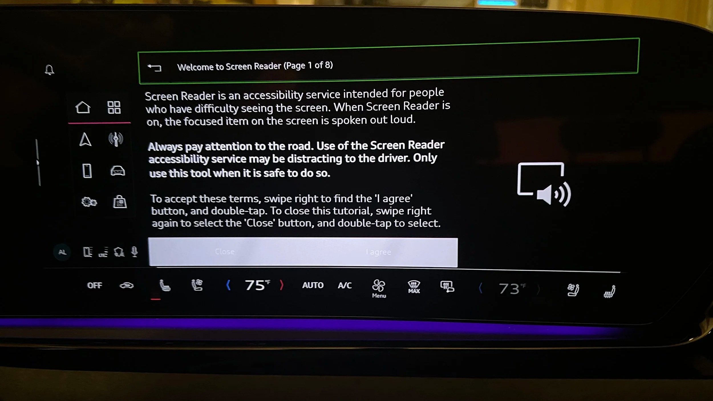
Screen Reader — tap-triggered audio narration of UI elements, routed through vehicle speakers with road-noise compensation.
Motor Disability
Touch interaction limited
On mobile
Uses Switch Control or voice commands (Voice Access on Android) to navigate without fine motor touch interaction.
Breaks in vehicle
Infotainment touch targets average 8–12mm — too small for tremor-affected users. No voice selection mode exists.
What we built
Voice Select — speaks labels on all interactive elements, user says the label to activate. No touch required.
Cognitive / Sensory
Complexity reduction needed
On mobile
Uses Guided Access, simplified interfaces, or high-contrast modes to reduce cognitive load and visual noise.
Breaks in vehicle
Modern infotainment UIs are dense and multi-layered. Information hierarchy is optimized for sighted, cognitively typical users.
What we built
Accessibility hub with independent toggles — users choose only what they need, no forced "accessibility mode" lock-in.
"Through collaborative research with our UX Researcher and Accessibility Leader's disability community partners, we confirmed that 68% of target users already had established mobile accessibility workflows. Our challenge was translation, not education."
03 - DESIGN CHALLENGE
What you can't simply
copy from mobile
This is the unique intellectual problem at the center of this project. Every automotive accessibility decision required rethinking mobile patterns from first principles — because the physical context, safety stakes, and input methods are fundamentally different.
04- PROCESS
How research shaped
every decision
Phase 01 — Discover
Mapping the regulatory and user landscape
I began by auditing the CVAA requirements alongside our Accessibility Leader to understand the exact legal scope. In parallel, our UX Researcher conducted structured interviews with users across the three disability archetypes — specifically asking about their mobile accessibility habits and what they expected from in-vehicle systems. Early sessions revealed a critical insight: users didn't want a separate "accessibility mode." They wanted their existing tools to work.
Research insight that changed the design
Every early concept proposed an "Accessibility Mode" that altered the entire UI. User feedback was clear: this felt stigmatizing and disorienting. We pivoted to an independent toggle model inside a dedicated Accessibility hub — invisible when not needed, but always present.
Phase 02 — Define
Setting the design principles for safety-critical HMI
Before sketching a single screen, I defined five binding principles with the platform team: (1) No feature should require more than one hand. (2) All audio output must survive 70dB road noise. (3) Every interaction must have a visible confirmation step. (4) Features must be fully operable via rotary input only. (5) No accessibility feature changes the experience of non-accessibility users.
My contribution at this stage
I owned the translation of research findings into interaction principles. The UX Researcher synthesized user data; I translated those insights into concrete design constraints that engineering and QA could test against.
Phase 03 — Ideate
Exploring — and discarding — three approaches
We explored three distinct directions before arriving at the released design. Direction A was a full-overlay "accessibility skin" that replaced the standard UI entirely — rejected because it broke brand consistency across Audi and Porsche. Direction B used floating persistent controls — rejected by safety engineering because overlays can obscure driving-critical information. Direction C was the hub-and-toggle model we shipped: self-contained, opt-in, brand-agnostic.
Phase 04 — Validate
Testing with disability community partners
We ran validation sessions with the Accessibility Leader's disability community partners across both our primary user archetypes. The most significant finding: the continuous narration model in our Screen Reader prototype caused cognitive overload for users in simulated driving scenarios. We iterated to tap-triggered narration — a model borrowed from the "confirm before acting" logic already familiar in automotive contexts. This single change went through three more rounds of testing before final approval.
What I'd do differently
We involved community partners in the Validate phase. They should have been in Define. Their feedback fundamentally changed the Screen Reader interaction model — but we arrived at it mid-build, costing two sprint cycles. Engaging earlier would have been more efficient and respectful of their expertise.
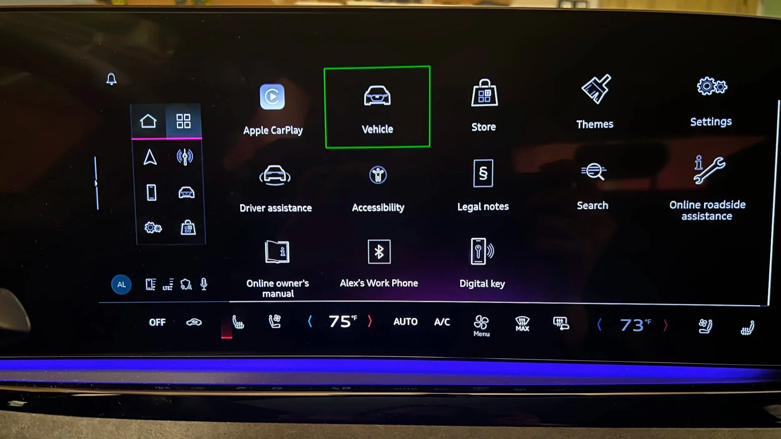
05- FEATURES
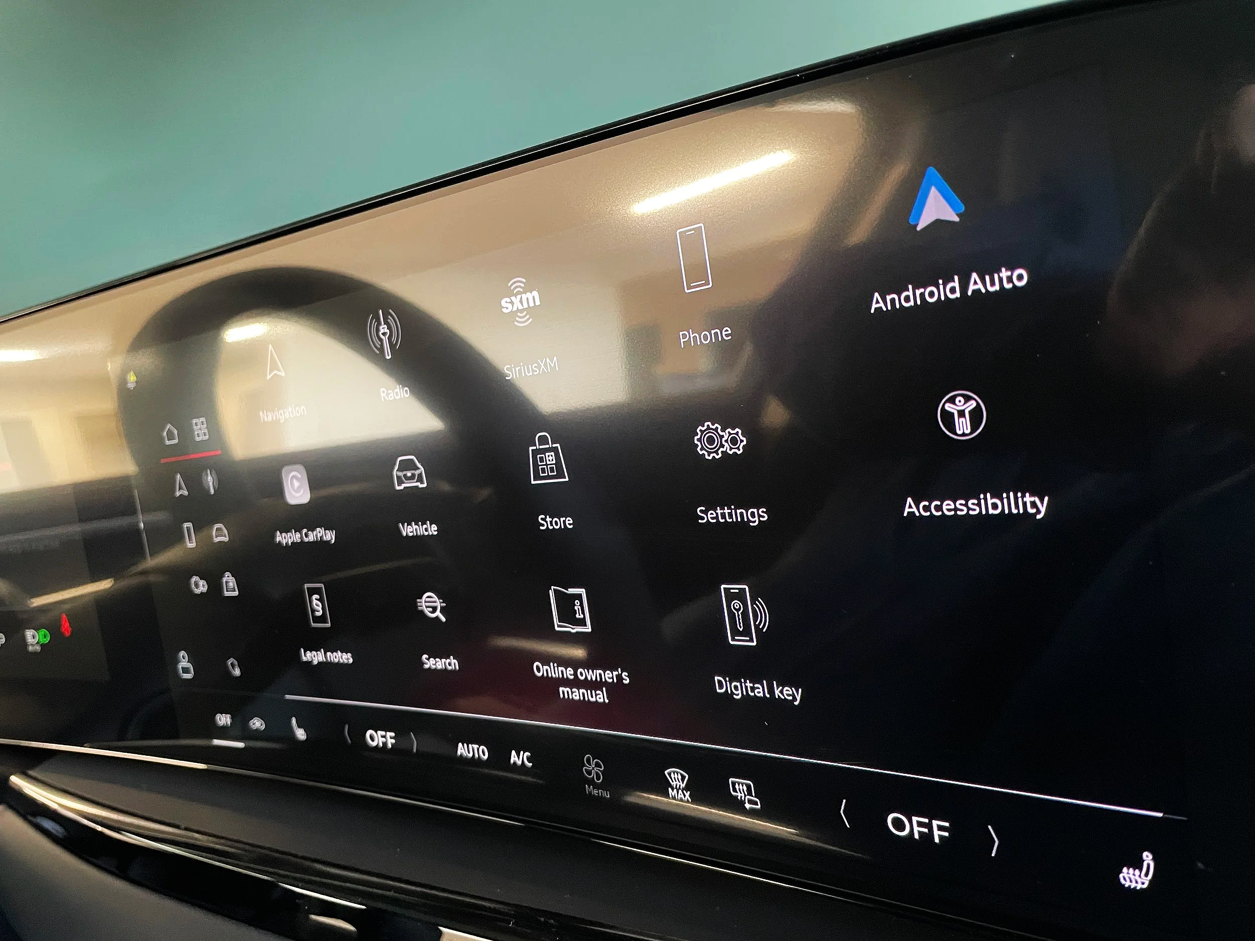
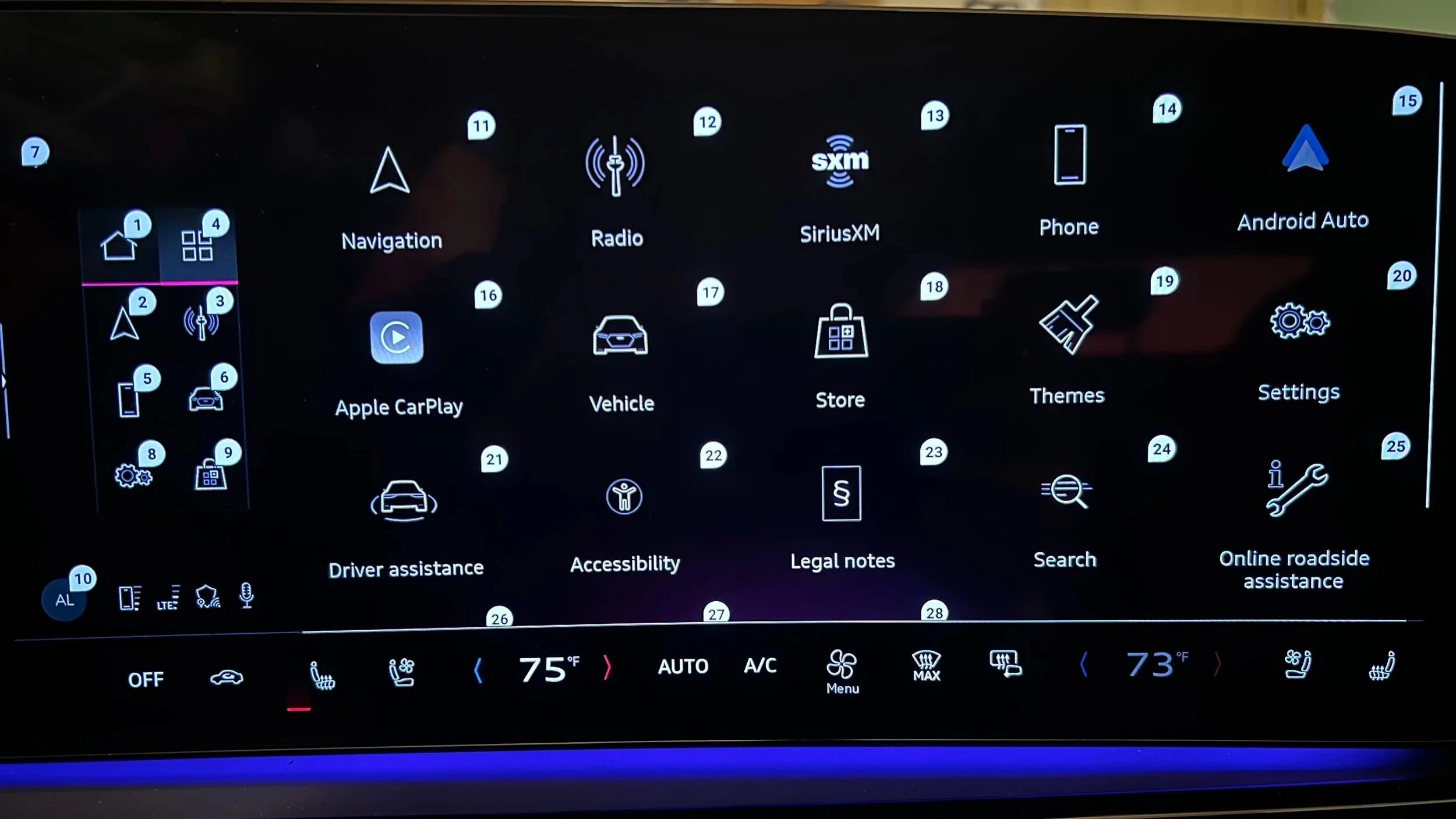
Actual image of Audi A5 2025 - Center infotainment Display - Home screen showing Accessibility Application
Feature 01
Screen Reader
Making every UI element audible — on demand, not constantly. Designed for visually impaired users who can drive but can't visually parse the display in real-time. Prioritized in V1 because it addressed the broadest CVAA compliance requirement and leveraged patterns the UX engineering team already understood from WCAG 2.1.
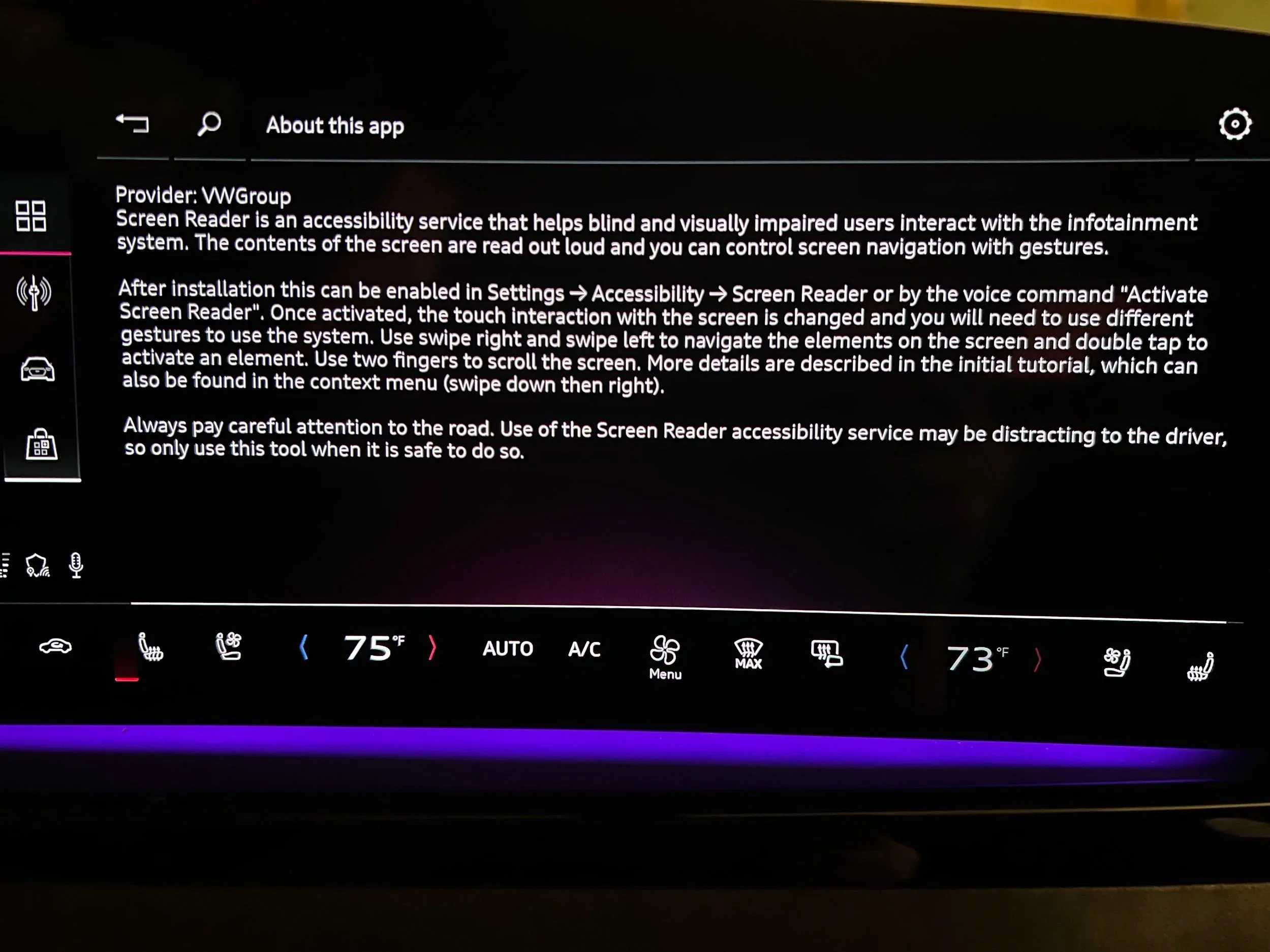
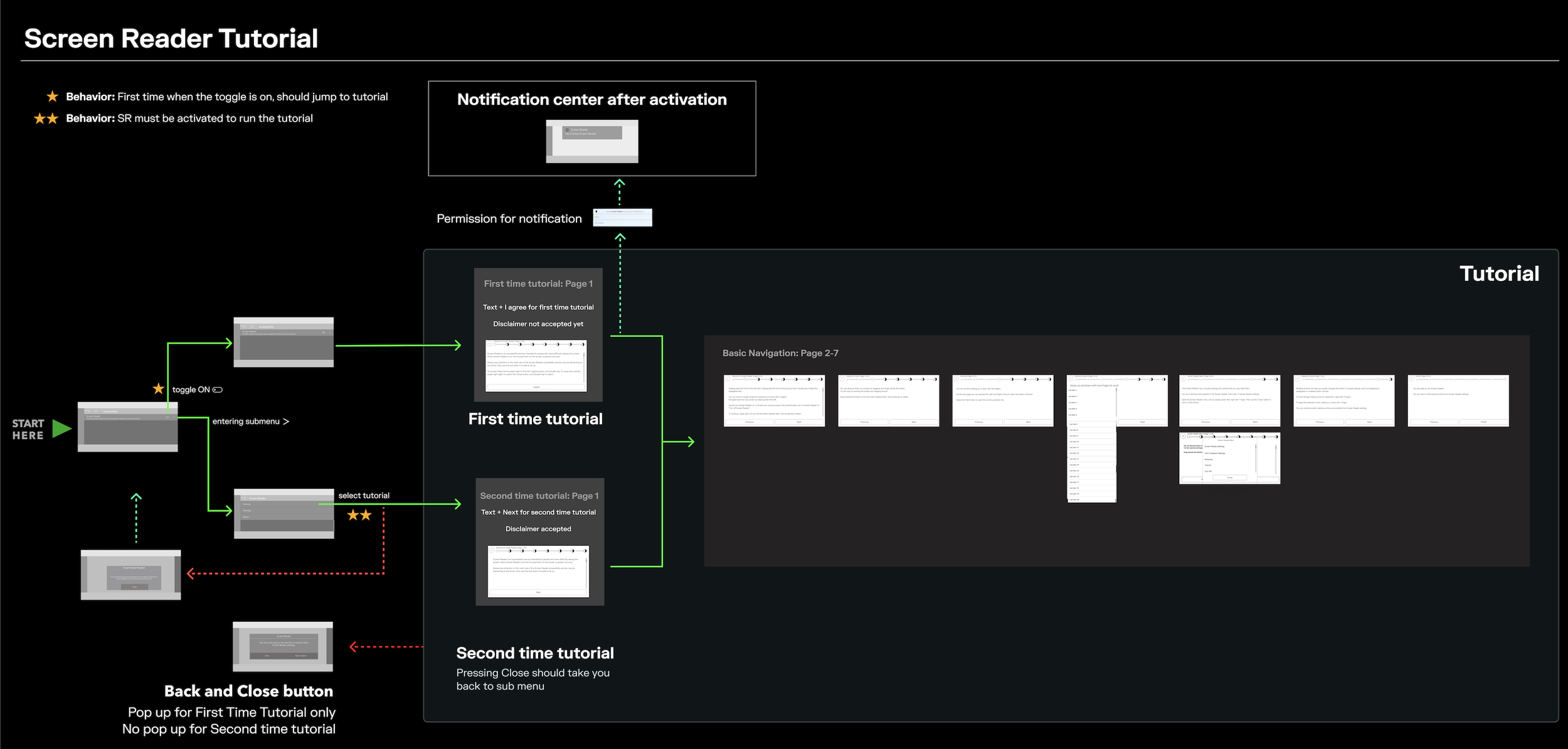
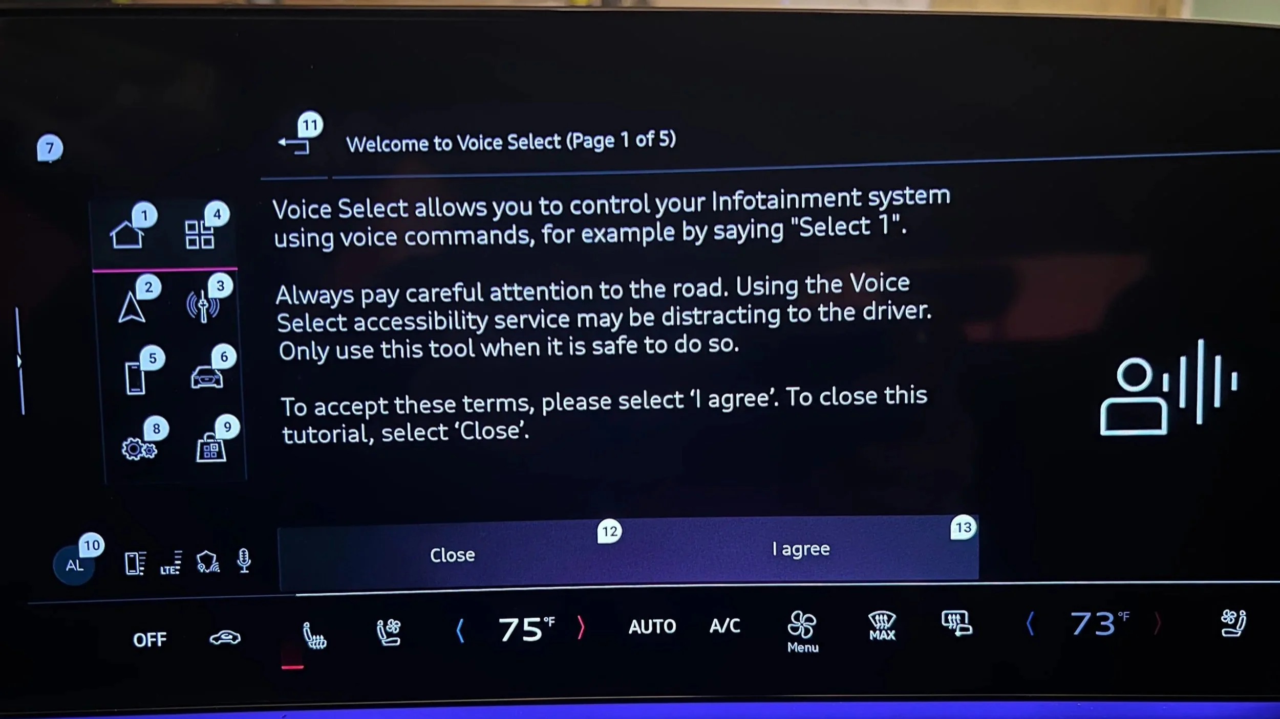
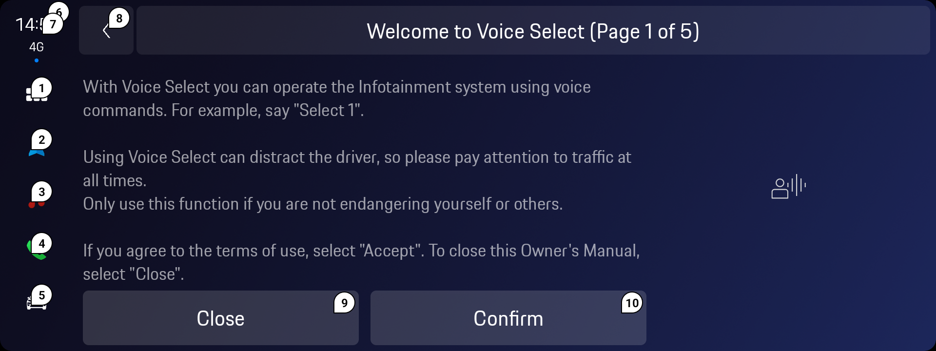
Interaction workflow — Figma technical delivery
Feature 02
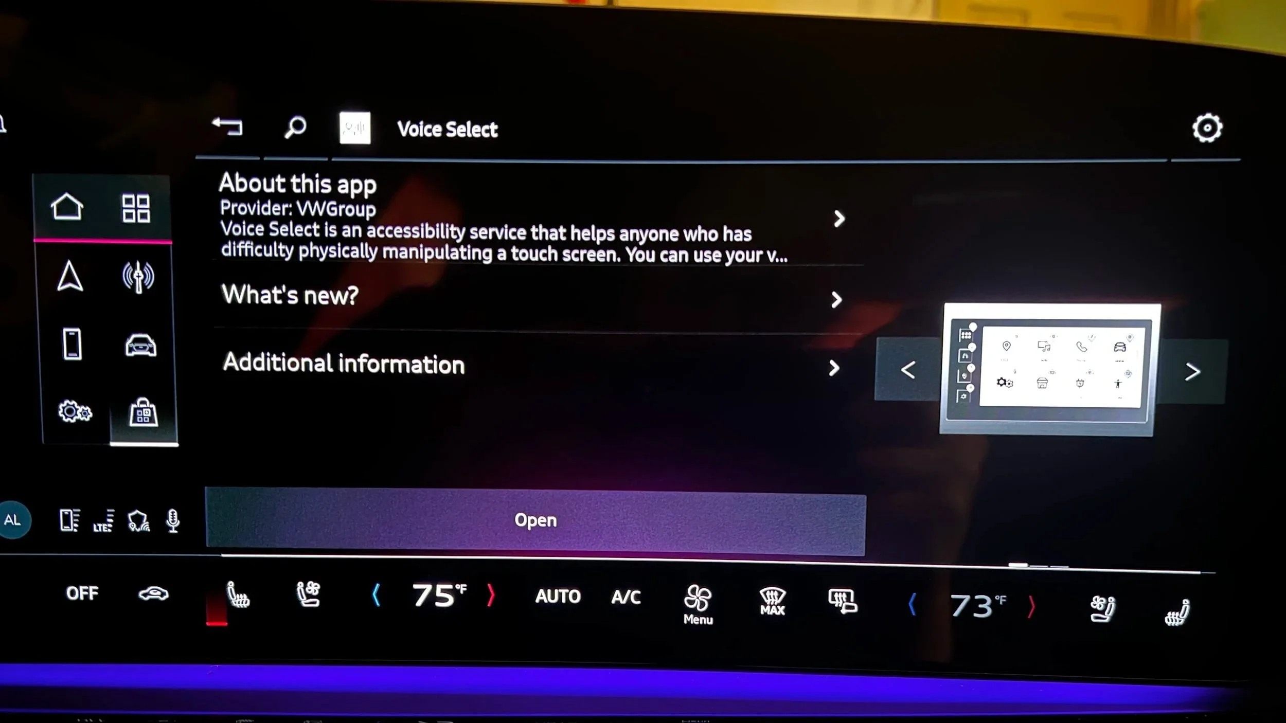
Voice Select
Enabling full UI navigation without touch — for users with limited fine motor control. Labels all interactive elements; user says the label aloud to activate it. The critical constraint: the vehicle already had a voice assistant with a wake word. Voice Select had to be visually distinct and operationally isolated to avoid command conflicts.
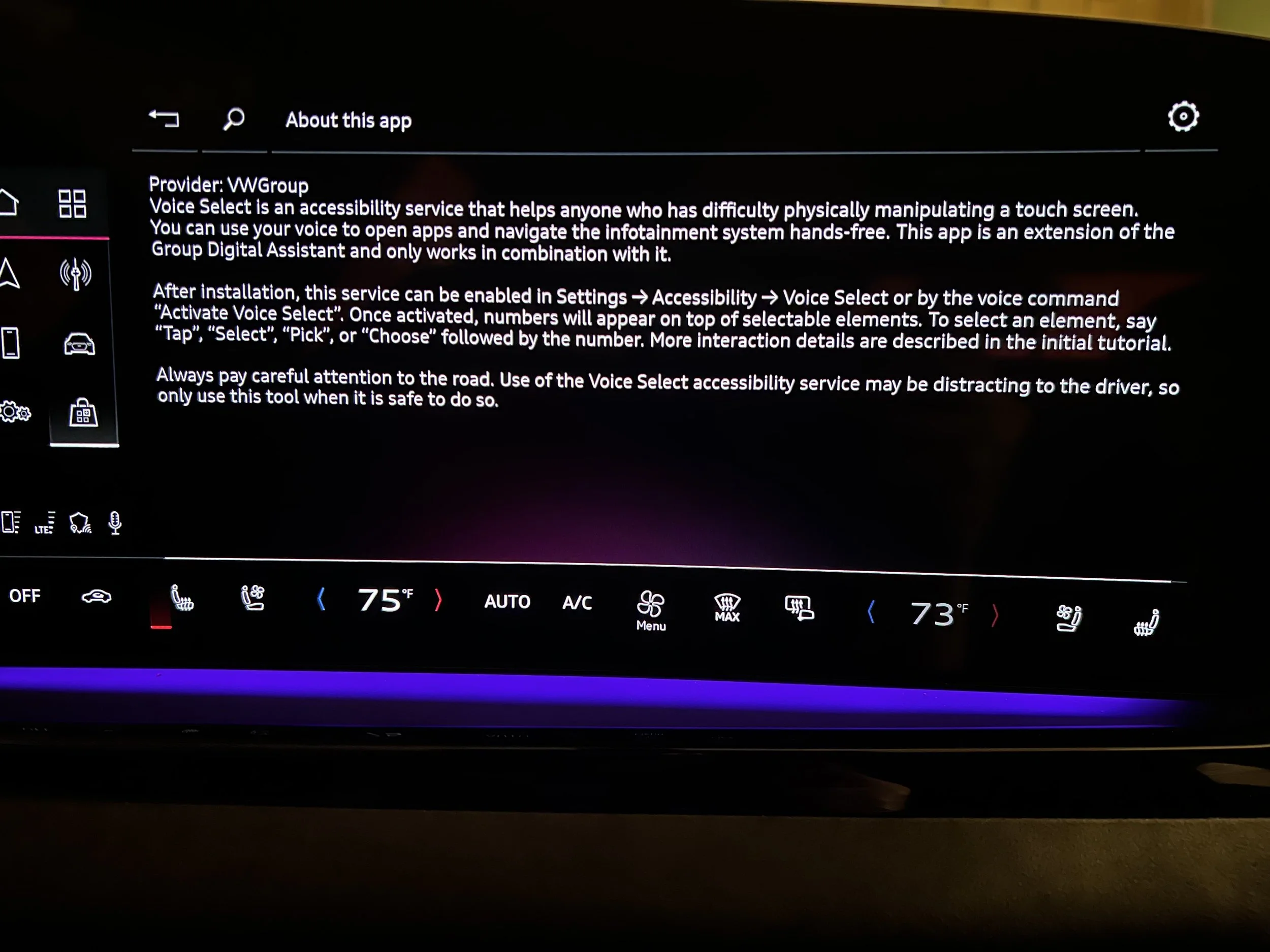
Voice Select as implemented in Porsche — same SDK, brand-specific visual language through design tokens
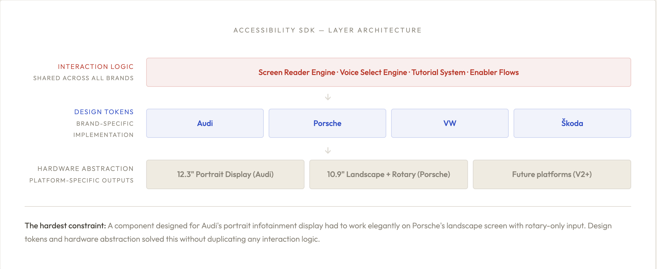
07- SYSTEM
One SDK,
four brands
The most scalable design decision in this project wasn't a UI pattern — it was the architecture. Rather than designing separate accessibility features per brand, I architected a single SDK with three layers: shared interaction logic, brand-specific design tokens, and hardware abstraction. A new brand could adopt the entire accessibility feature set by implementing only the token layer.
ACCESSIBILITY HUB - THE ENTRY POINT ACROSS BOTH BRANDS
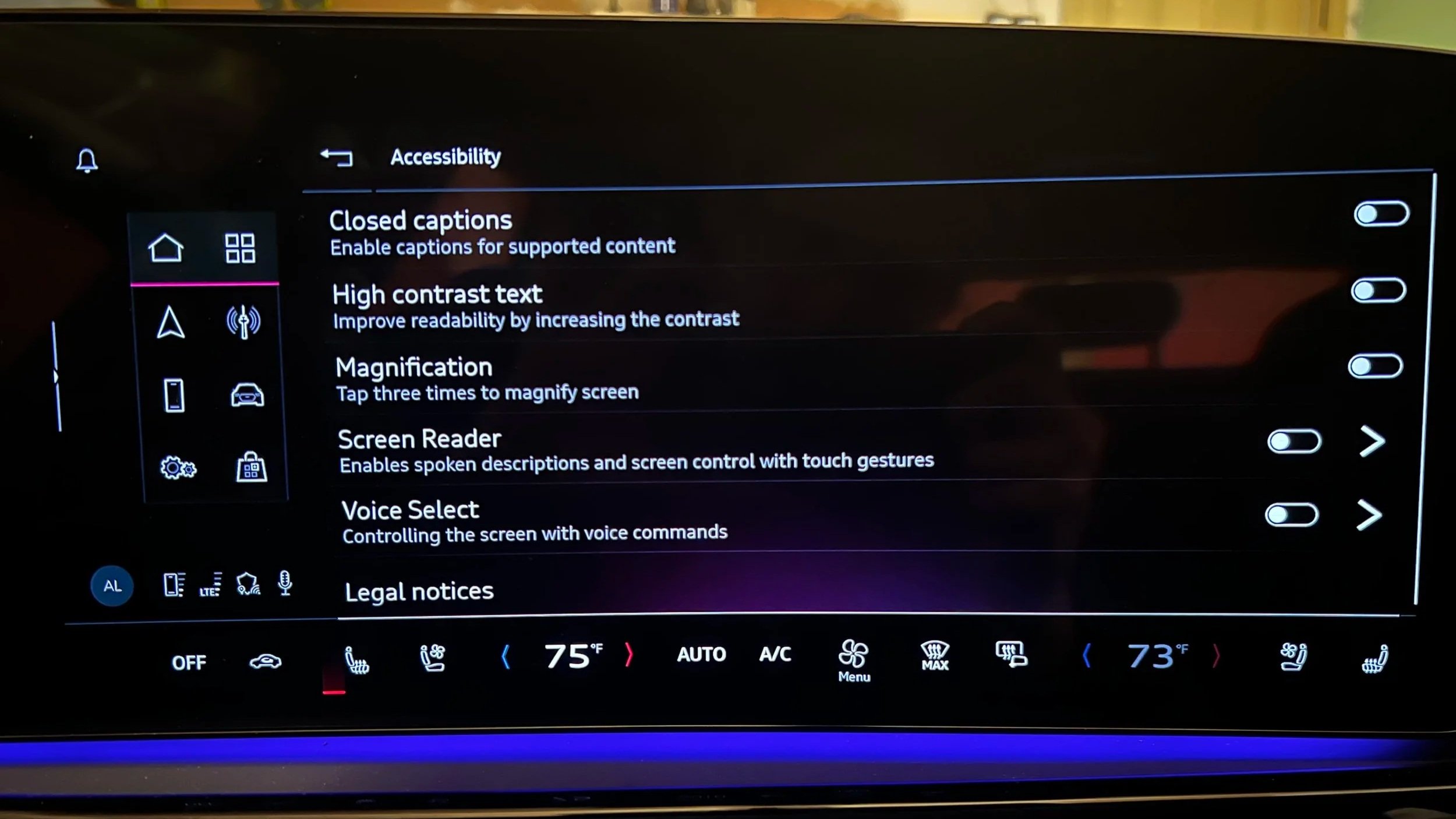
Accessibility Menu — Audi. User sees only features relevant to them; no "full accessibility mode" forcing all features on.
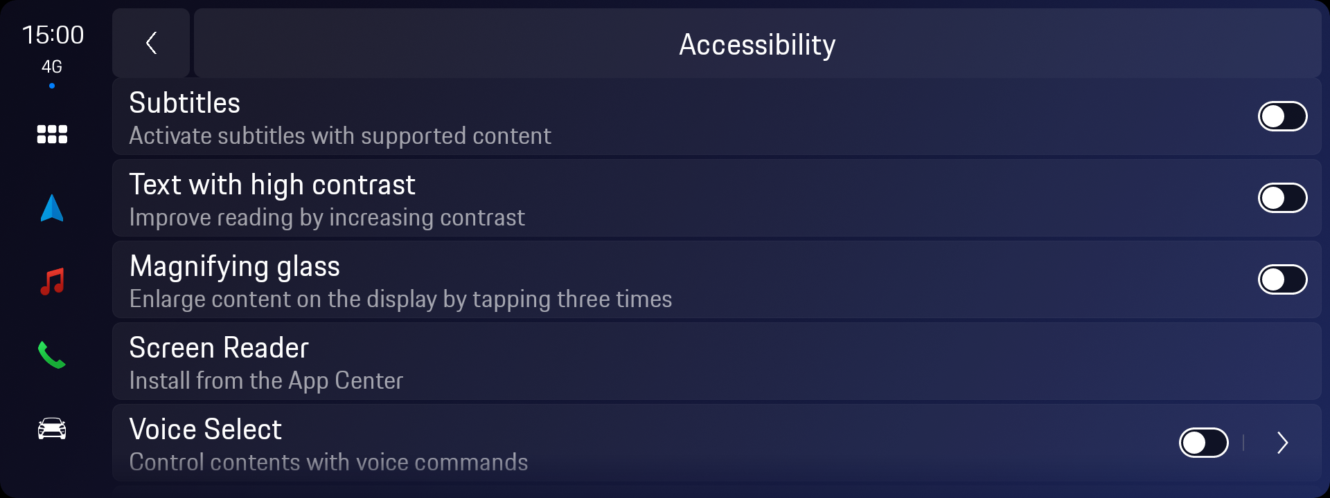
Accessibility Menu — Porsche. Same interaction logic, Porsche design token layer. No additional feature development required.
Accessibility Application